
Configured at compile time via the src/styles/variables/_grid.scss file.
Breakpoints
The grid ships with five predefined breakpoints. All breakpoints are mobile-first (min-width): a rule set at md applies from 672 px upward and is inherited by lg, xl, and xxl unless overridden.
| Name | Min-width |
|---|---|
sm | 320px |
md | 672px |
lg | 1056px |
xl | 1312px |
xxl | 1584px |
TIP
These breakpoint names are important because you use them as keys in responsive prop objects. They can be overridden in src/styles/variables/_breakpoints.scss or by replacing the $breakpoints map.
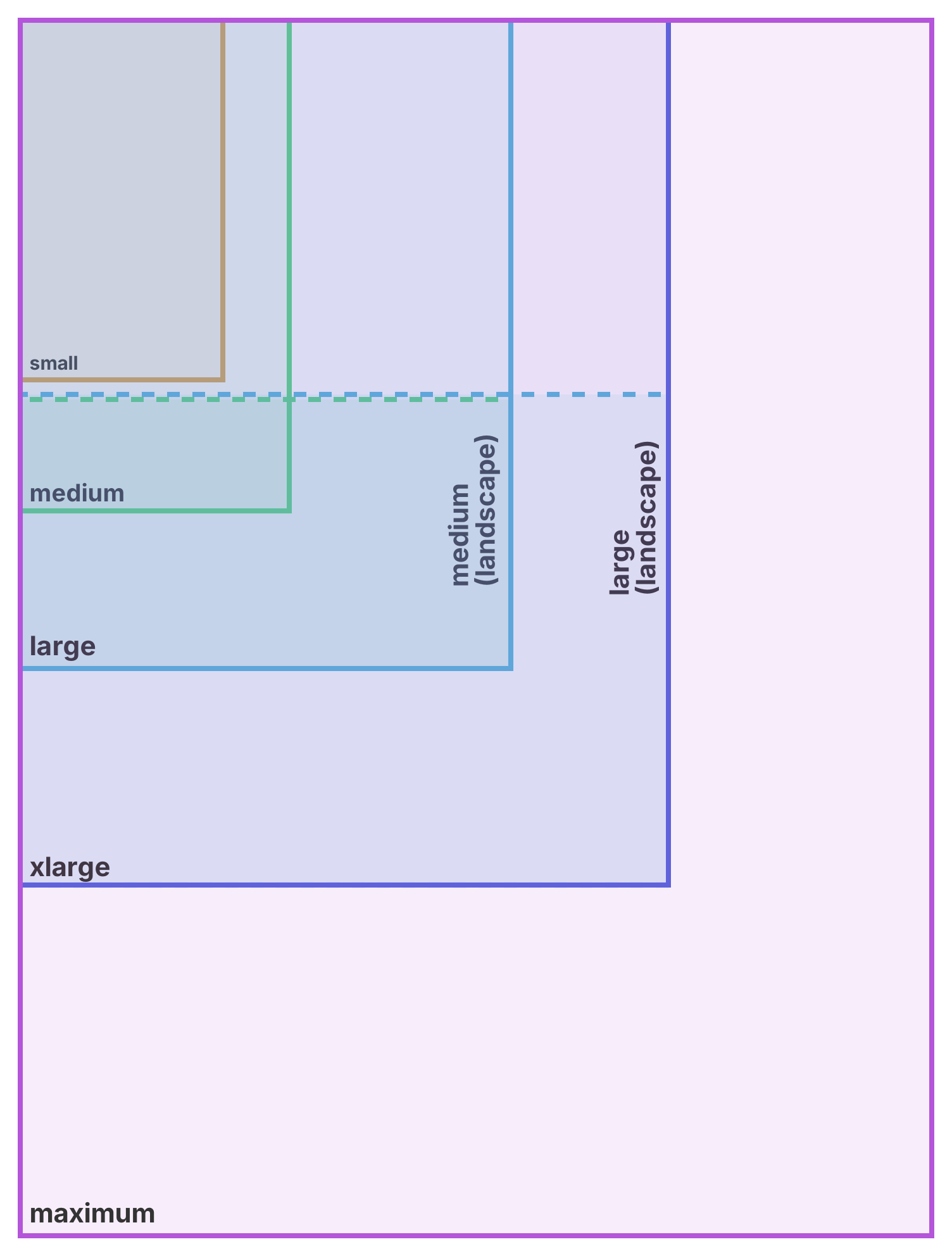
Columns and Gap
Columns default to 16. The gap system uses an 8px base unit with a named scale:
| Name | Value |
|---|---|
xxs | 2px |
xs | 4px |
sm | 8px |
md | 16px |
lg | 24px |
xl | 32px |
xxl | 48px |
TIP
Gap tokens are configured in src/styles/variables/_grid.scss via the $gap-ratios map.
Visual Demo
Refs
To get the underlying DOM element from a nb-grid, use the getRef() method it exposes — the component ref itself points to the Vue instance, not the element.
<template>
  <nb-grid ref="myComponent"> test </nb-grid>
</template>

<script setup lang="ts">
import { ref } from 'vue'

const myComponent = ref()

console.log(myComponent.value)
console.log(myComponent.value.getRef())
</script>